Kitchen Color Ideas That Pop
When you walk into a kitchen that feels flat, the first instinct is often to reach for a fresh coat of paint. A well‑chosen hue can turn a functional space into a visual centerpiece without a full remodel. In this article you’ll discover seven distinct color approaches that add personality, balance practicality, and keep the room feeling welcoming. Each idea includes guidance on how to integrate the shade with cabinetry, countertops, lighting, and accessories, so you can move from concept to confident execution.
1. Deep Navy Cabinets with Warm Metallic Accents
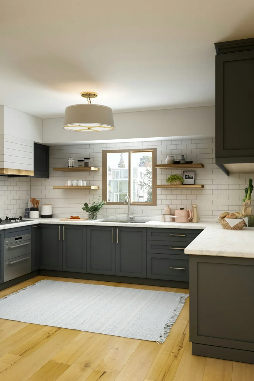
Photo by Collov Home Design on Unsplash
Dark navy creates a dramatic backdrop that instantly draws the eye, especially when paired with brass or brushed gold hardware. The richness of the shade absorbs light, making the kitchen feel intimate without feeling cramped, provided the room receives ample natural daylight or layered lighting. To keep the space from feeling too heavy, balance the cabinets with lighter countertops—white marble or a soft greige quartz works well—and introduce open shelving that showcases white dishware. The metallic pulls add a touch of reflectivity, helping to bounce light around the room. One consideration is that deep pigments can show fingerprints more readily, so choose a finish that resists smudging, such as a semi‑gloss enamel. When the navy feels too imposing, a lighter accent wall or a pastel backsplash can soften the overall impact.
2. Soft Sage Green Walls Complemented by Natural Wood
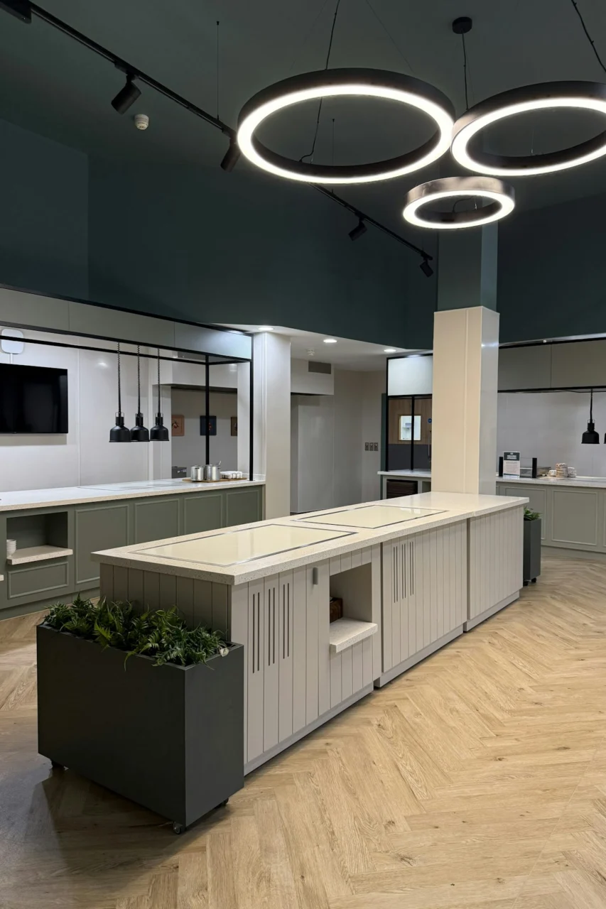
Photo by Ceba Solutions on Unsplash
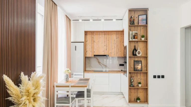
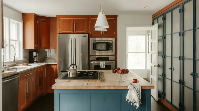
Sage green offers a muted, nature‑inspired hue that pairs beautifully with the warmth of reclaimed oak countertops or a butcher‑block island. The subtle green brings a sense of calm while still providing enough color to stand out against neutral appliances. Because the tone is light, it reflects daylight, which is ideal for kitchens lacking large windows. To avoid a monochrome look, introduce texture through woven baskets, linen dish towels, or a patterned tile runner. The wood elements add tactile interest and help hide minor scratches that can occur with everyday cooking. A potential downside is that green can clash with overly cool lighting, so opt for warm‑white LED bulbs that enhance the earthy undertones.
3. Bold Mustard Island as a Focal Point
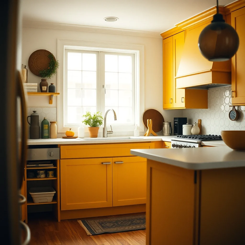
A mustard‑colored island can become the centerpiece of an otherwise understated kitchen. The warm, golden hue energizes the space and works especially well with dark gray or charcoal cabinetry, creating a high‑contrast composition that feels modern. Because the island is typically a high‑traffic area, choose a durable paint finish—such as a satin or low‑gloss enamel—that can withstand occasional splatters. Pair the island with matte black stools or brushed nickel pendant lights to reinforce the contemporary vibe. If the kitchen already contains a lot of warm tones, consider a cooler countertop material like white quartz to prevent the palette from becoming too saturated.
4. Charcoal Slate Backsplash with Light Upper Cabinets
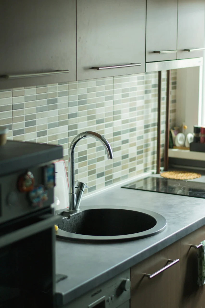
Photo by Filip Baotić on Unsplash
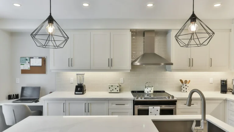
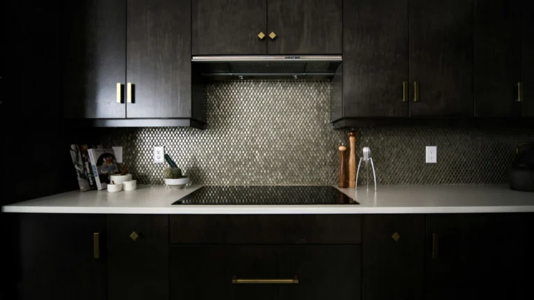
A slate‑inspired charcoal backsplash adds depth without overwhelming the room, particularly when the upper cabinets remain a light neutral like off‑white or pale greige. The dark surface acts as a visual anchor, allowing you to experiment with brighter accessories such as copper cookware or colorful glassware. Slate tiles also provide a natural texture that hides water spots better than glossy ceramics. When selecting the grout, a slightly lighter shade can soften the starkness and make cleaning easier. The main trade‑off is that a very dark backsplash can absorb light, so ensure you have sufficient task lighting—under‑cabinet LEDs work well to illuminate work zones.
5. Crisp Aqua on a Small Breakfast Nook

Photo by Jesse Cortez on Unsplash
Aqua brings a refreshing pop that feels especially appropriate in a sunny corner where morning coffee is enjoyed. The cool blue‑green shade pairs nicely with white shaker cabinets and natural rattan chairs, creating a breezy, coastal feel. Because the area is limited, the color should be confined to the wall behind the table or to the chair upholstery; extending it to larger surfaces could overwhelm the space. To keep the look cohesive, introduce sea‑glass vases or turquoise dishware as accent pieces. One limitation is that aqua can appear muted under incandescent lighting, so favor daylight‑balanced bulbs to maintain its vibrancy.
6. Rich Terracotta Floor Tiles with Minimalist White Walls
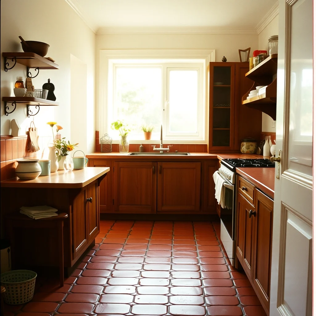
Terracotta flooring adds an earthy, warm foundation that instantly gives a kitchen character. When the walls stay a clean white, the floor becomes the star without competing with other elements. The reddish hue works well with stainless‑steel appliances, as the cool metal balances the warmth of the tiles. Because floor tiles endure heavy foot traffic, choose a glazed finish that resists stains and is easy to mop. A practical tip is to place a runner in front of the sink to protect high‑traffic zones while still showcasing the tile pattern. If the kitchen receives limited sunlight, consider a lighter shade of terracotta to prevent the room from feeling too dim.
7. High‑Gloss Emerald Island Paired with Matte Black Appliances
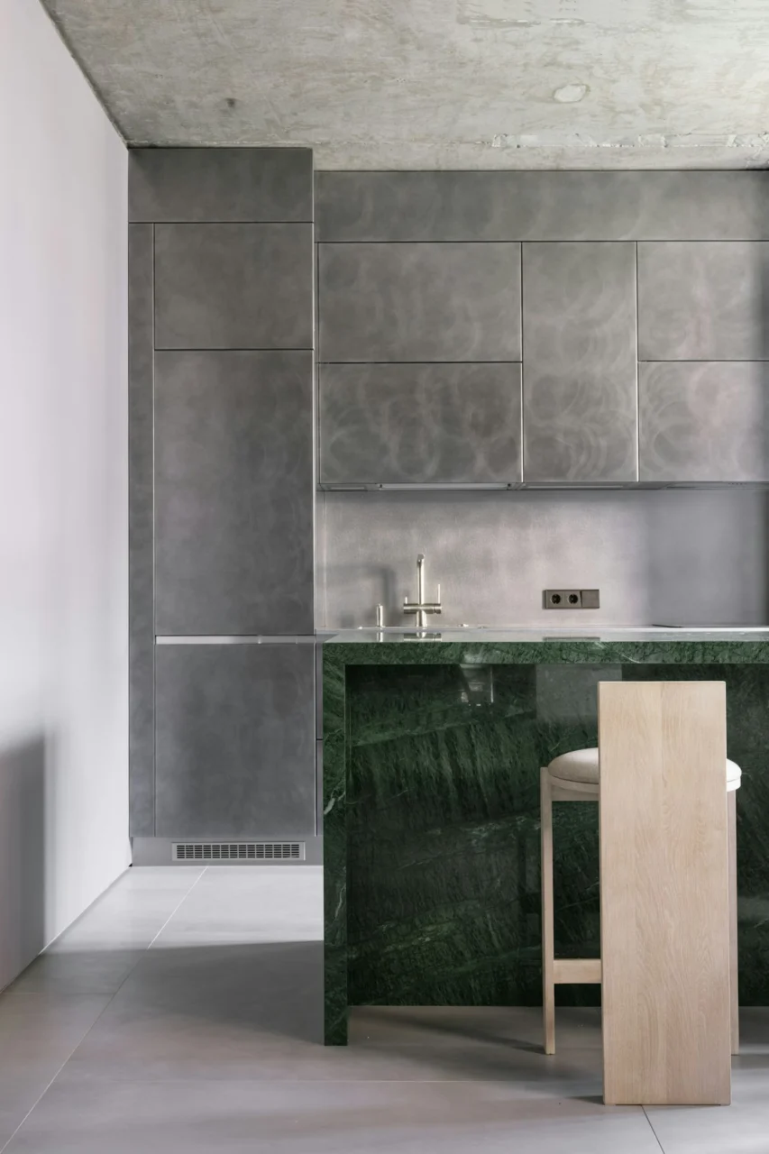
Photo by Alexey Aladashvili on Unsplash
Emerald green, when applied with a high‑gloss finish, creates a sleek, almost reflective surface that feels luxurious in a modern kitchen. The glossy sheen catches ambient light, making the island appear larger than it is—a useful effect for compact layouts. Pairing the island with matte black appliances establishes a sophisticated contrast that feels both contemporary and timeless. Because high‑gloss paint can show fingerprints, select a low‑maintenance topcoat and keep a microfiber cloth handy for quick touch‑ups. If the kitchen lacks natural light, incorporate under‑cabinet lighting to accentuate the sheen without creating glare.
FAQ
Photo by Jaykumar Bherwani on Unsplash
What paint finish works best for kitchen cabinets?
A semi‑gloss or satin finish is ideal because it balances durability with a subtle sheen that resists moisture and stains.
Can I use bold colors in a small kitchen without making it feel cramped?
Yes, by limiting bold hues to a single wall, an island, or a backsplash, you can add visual interest while keeping the overall space feeling open.
How do I choose lighting that enhances dark wall colors?
Layered lighting—combining overhead fixtures with under‑cabinet LEDs and pendant lights—helps illuminate dark surfaces and prevents shadows from deepening the color.
Is it safe to paint over existing glossy cabinets?
It can be safe if you properly sand the surface to create adhesion and apply a primer designed for glossy finishes before repainting.
What are low‑maintenance flooring options for a kitchen?
Porcelain tile, especially when glazed, offers resistance to stains and scratches, making it a practical choice for high‑traffic cooking areas.
Final Thoughts
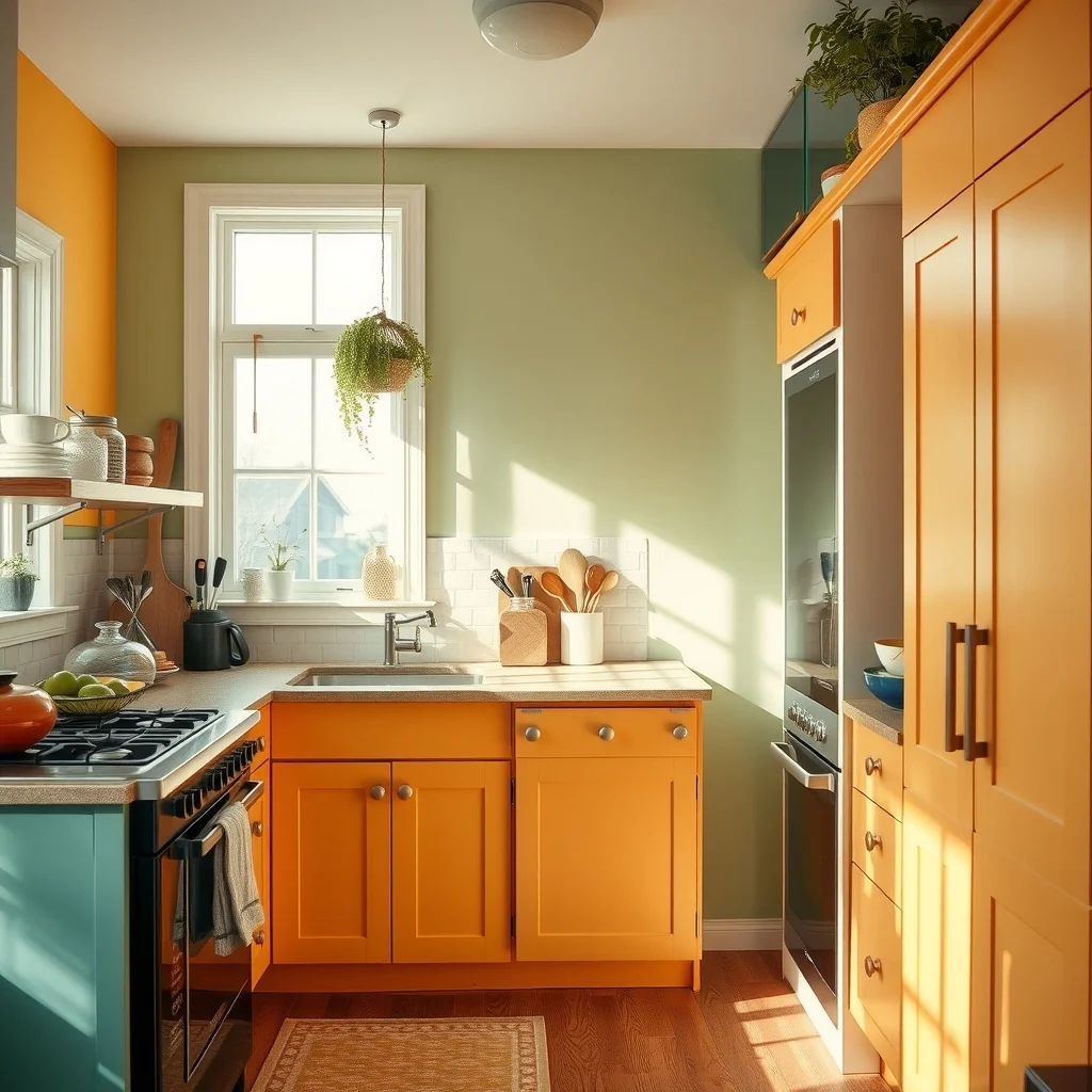
Choosing a color that pops doesn’t have to mean sacrificing practicality. By considering how a hue interacts with light, materials, and the overall layout, you can create a kitchen that feels both lively and livable. Whether you gravitate toward deep navy cabinets, a sunny aqua nook, or a daring emerald island, the key is to balance the statement with complementary neutrals and thoughtful lighting. With the right finish and a few strategic accents, your kitchen can become a vibrant hub that reflects your personal style while standing up to everyday use.